Logo Design for Ooomami
They originally wanted to use a classic script, I sketched up some ideas which were based on scripts but in a individual style which wouldn’t date quickly.
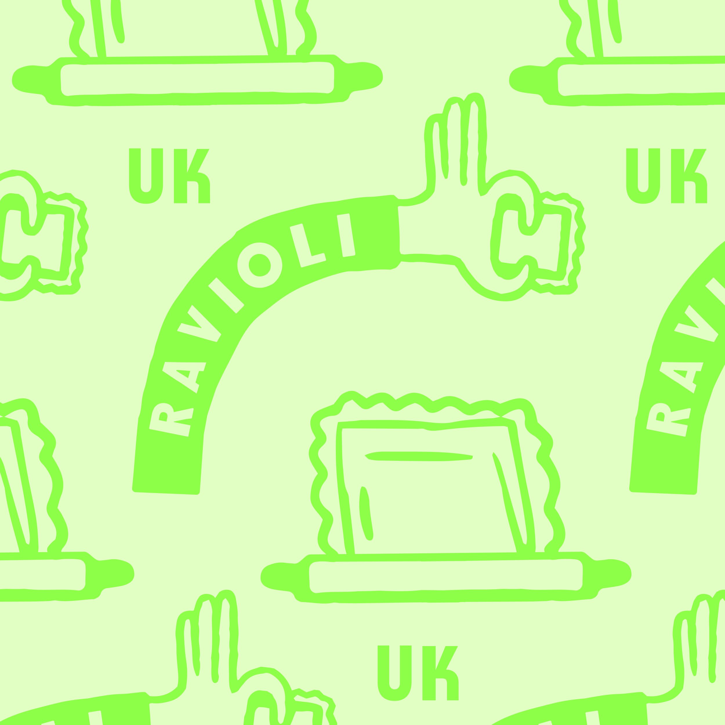
The illustration elements came after we worked on the main logo. To create these I took information they had provided about their process and reasons for starting the business and communicated these points in a playful/lighthearted way.
Logo system and wider brand identity for Ooomami a food truck which specialises in fried ravioli, a dish which is common in Italy and one they want to bring it to the UK festival and event scene.
It was important for this system to include a fully customised word mark, illustration elements, a core logo design, secondary logo design, colours and font options for the client to use on other brand materials.


The business is co-ownded by two friends who love food, love meeting people and love the service Industry. I wanted to create a few illustrations which reflected how much they enjoy the process of making and serving their food. Nothing to serious hence the silly arms and hands.


The logo icon on the left started off as loads of sketches which revolved around making and serving pasta. After working into them I realised I could combine the three most important parts of the brand 1. Food Truck 2. Ravioli 3. Take Away.

In the end we established a personality for the brand through brand identity. I included logo, illustration, fonts, colours, patterns etc. This meant the business could take the brand pack and were ready to roll it out across social media, websites, merch, signage and so on.