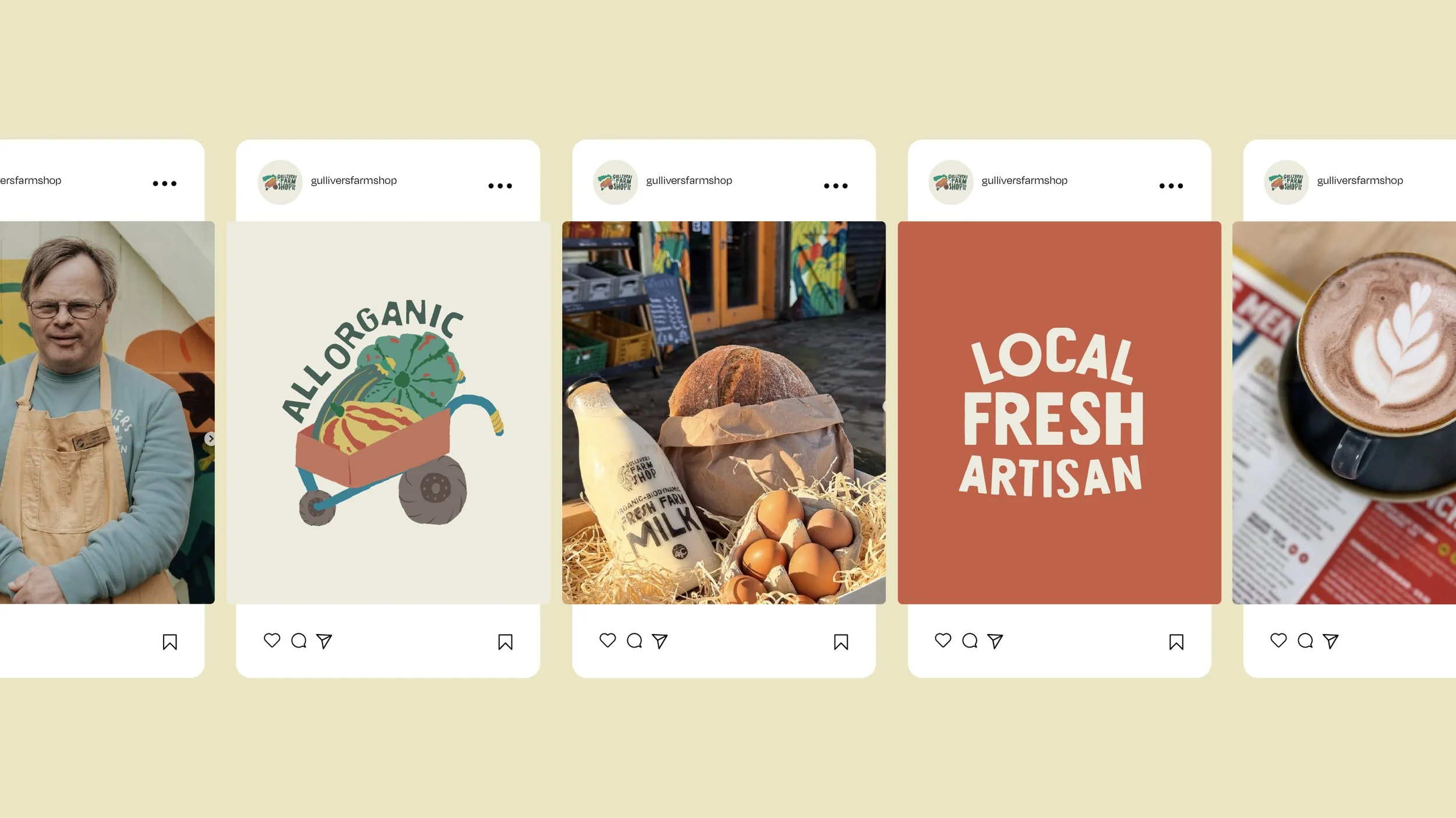
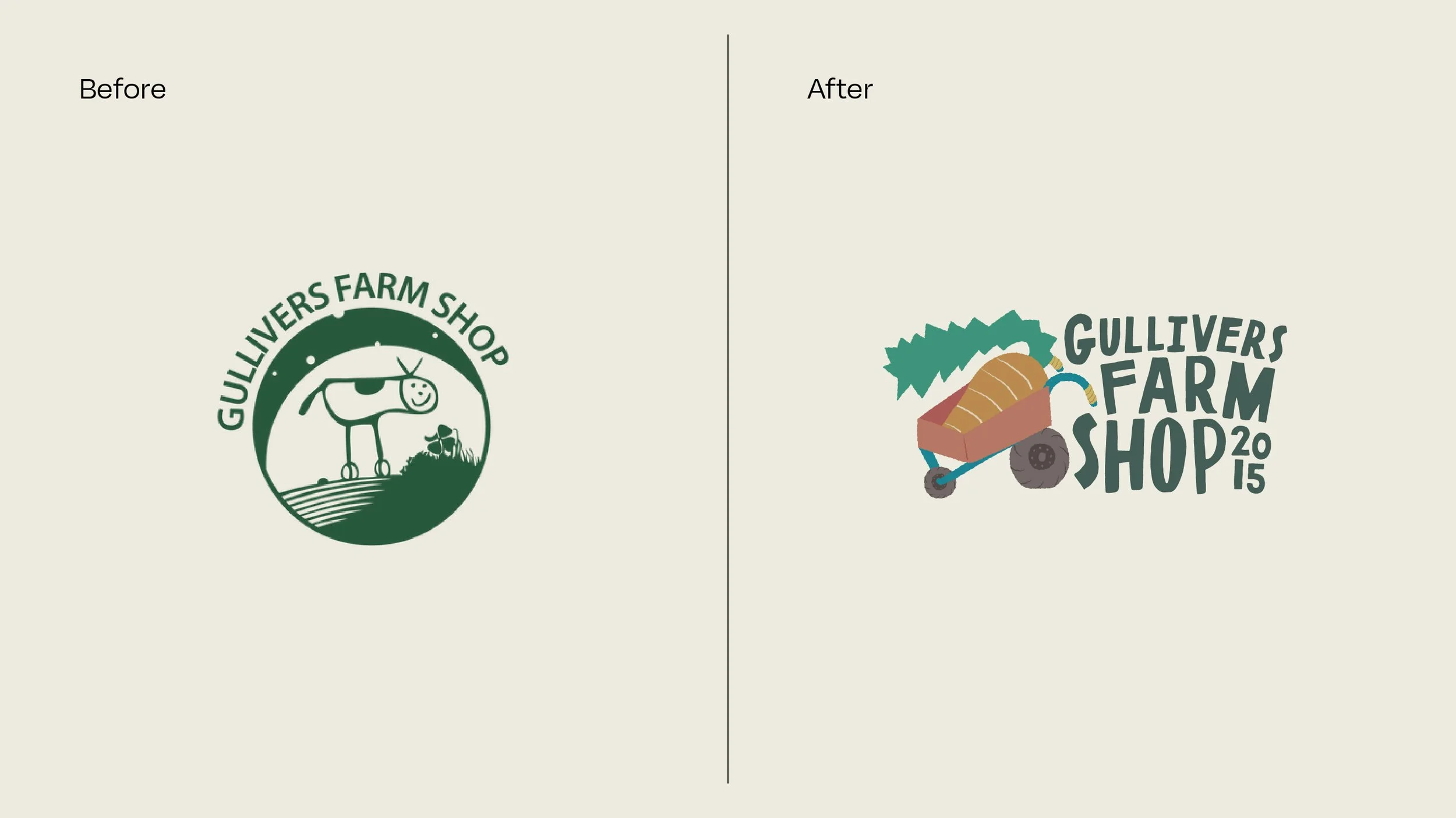
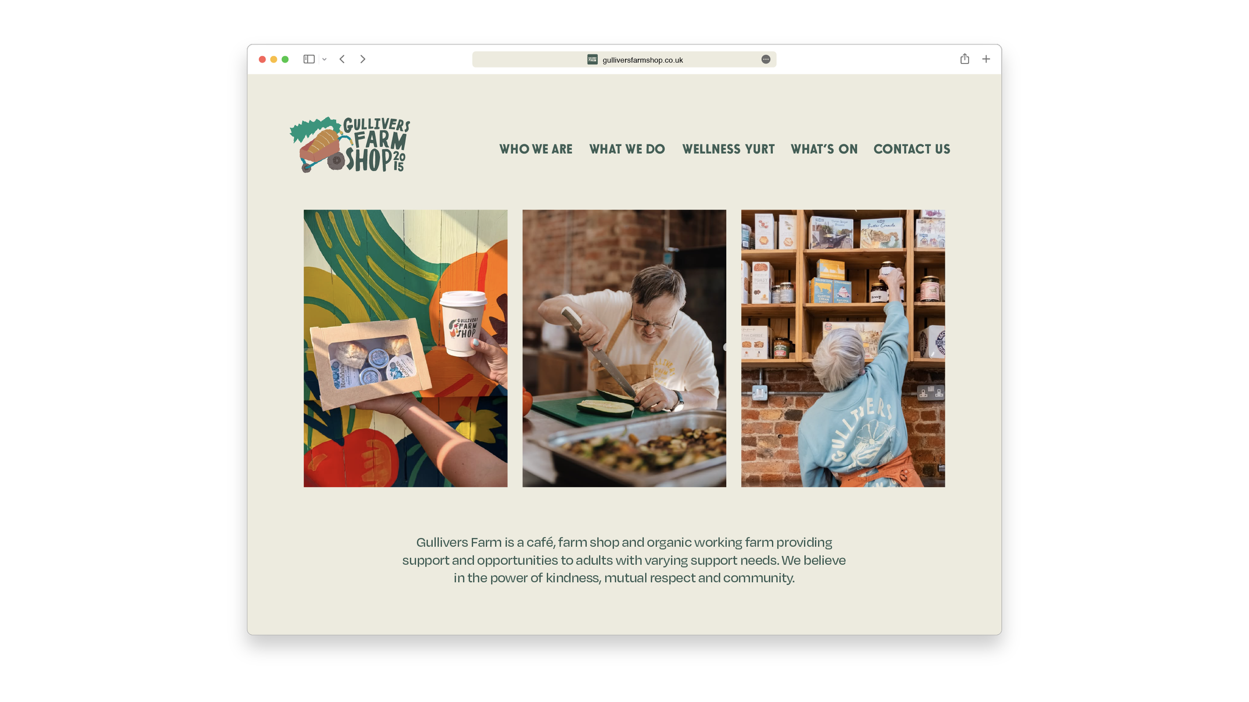
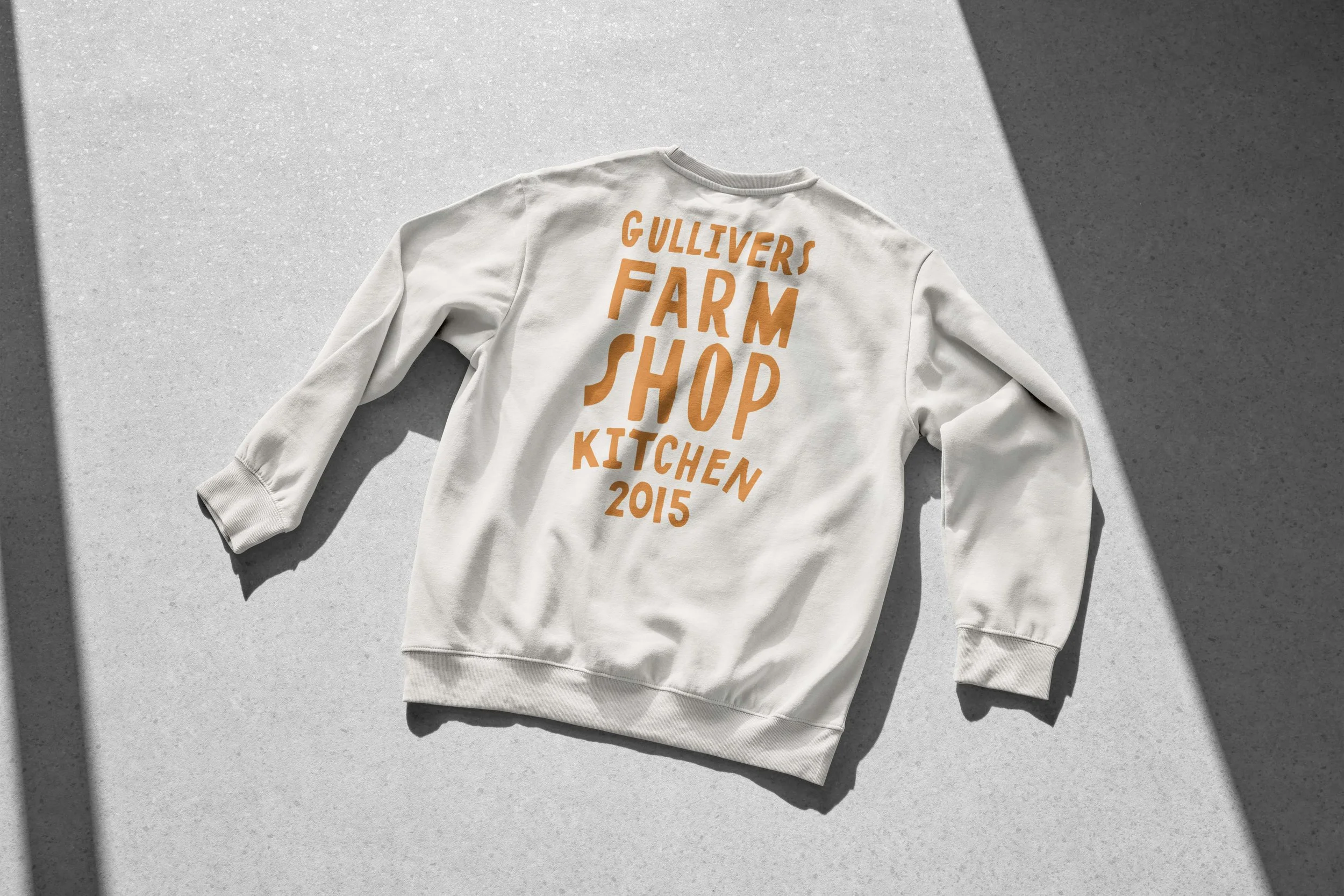
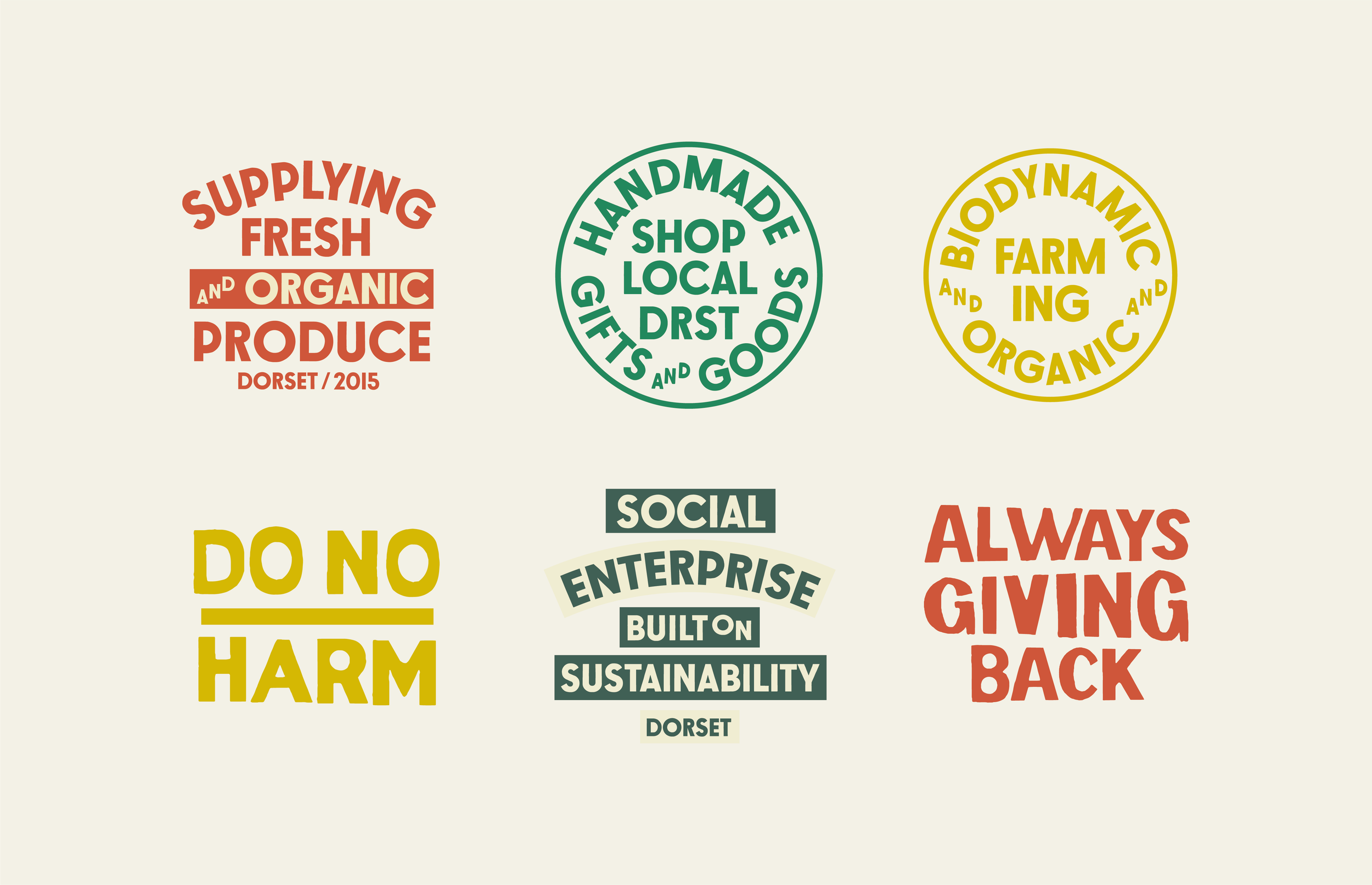
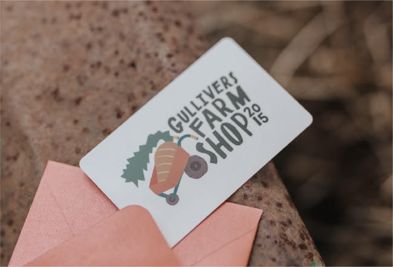
Case Study

Branded tissue paper for farm

Gullivers Farm Shop is a biodynamic working farm, café and community space in Dorset, producing organic food and sustainable goods while creating meaningful work and support opportunities for adults with additional needs. Rooted in kindness, sustainability and local connection, it brings together farming, food and people to nurture both the land and the community around it.

The Problem:

When Gullivers approached us, their brand wasn’t reflecting the scale or significance of what they had built. They were operating as a biodynamic farm, farm shop, café and social enterprise, alongside hosting events and wellness experiences, but this richness wasn’t being communicated to their audience.

With only a basic logo in place, there was no wider brand system to help tell their story, express their values, or show the full extent of what they offered. As a result, the business wasn’t connecting as strongly as it could with potential visitors, and the brand was being held back from its ability to grow and be recognised as the unique destination it truly was.

The Solution:

We created a full brand system that clearly communicates the different parts of the business and how people can engage with them from farm and shop to café, events and wellbeing. Instead of relying on a single logo, the new identity brings everything together under one cohesive, recognisable world.

The approach centred around distinctive typography and bespoke illustration that felt completely personal to Gullivers. Collaborating with illustrator Primina Hirst allowed us to capture small, meaningful moments from the family-run farm through characterful storytelling.

website design for farm branding
customised typography for logo design
Logo design for farm used on a coffee cup

These illustrations became the foundation for the colour palette and visual language, giving the brand warmth, depth and personality.

To ensure consistency as the business grows, we also defined a clear direction for photography and social media creating a repeatable, cohesive style that strengthens recognition, builds emotional connection and encourages customers to return and support the farm.

Set of Word marks for brand identity
Set of logo designs with illustration elements including veg and chickens
set of illustration and typography lock-ups to describe the core services the farm offers
set of custom typography lock-ups all in a dark green for farm brand identity, organic style