A brand designed to turn first visits into loyal regulars…


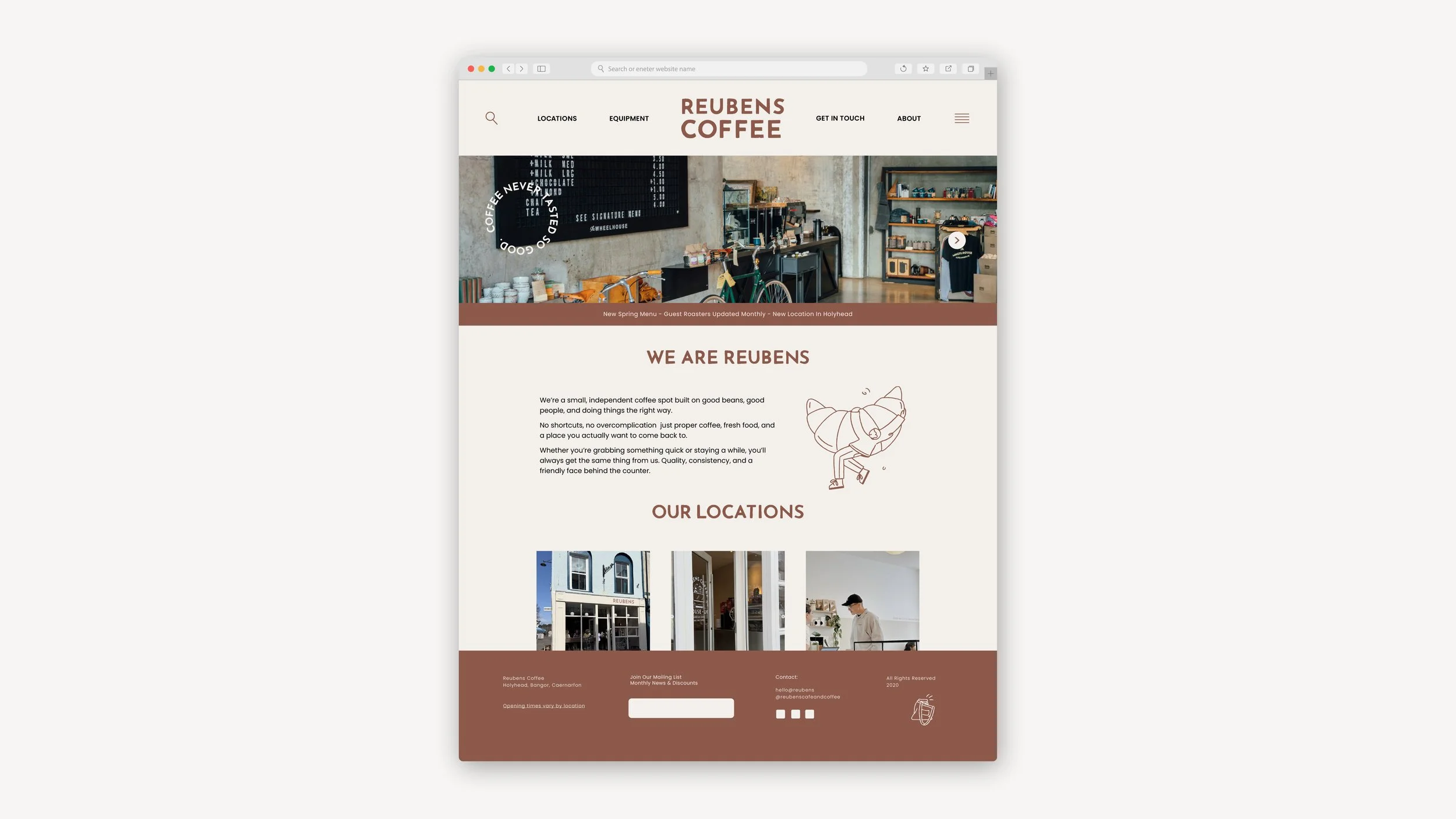
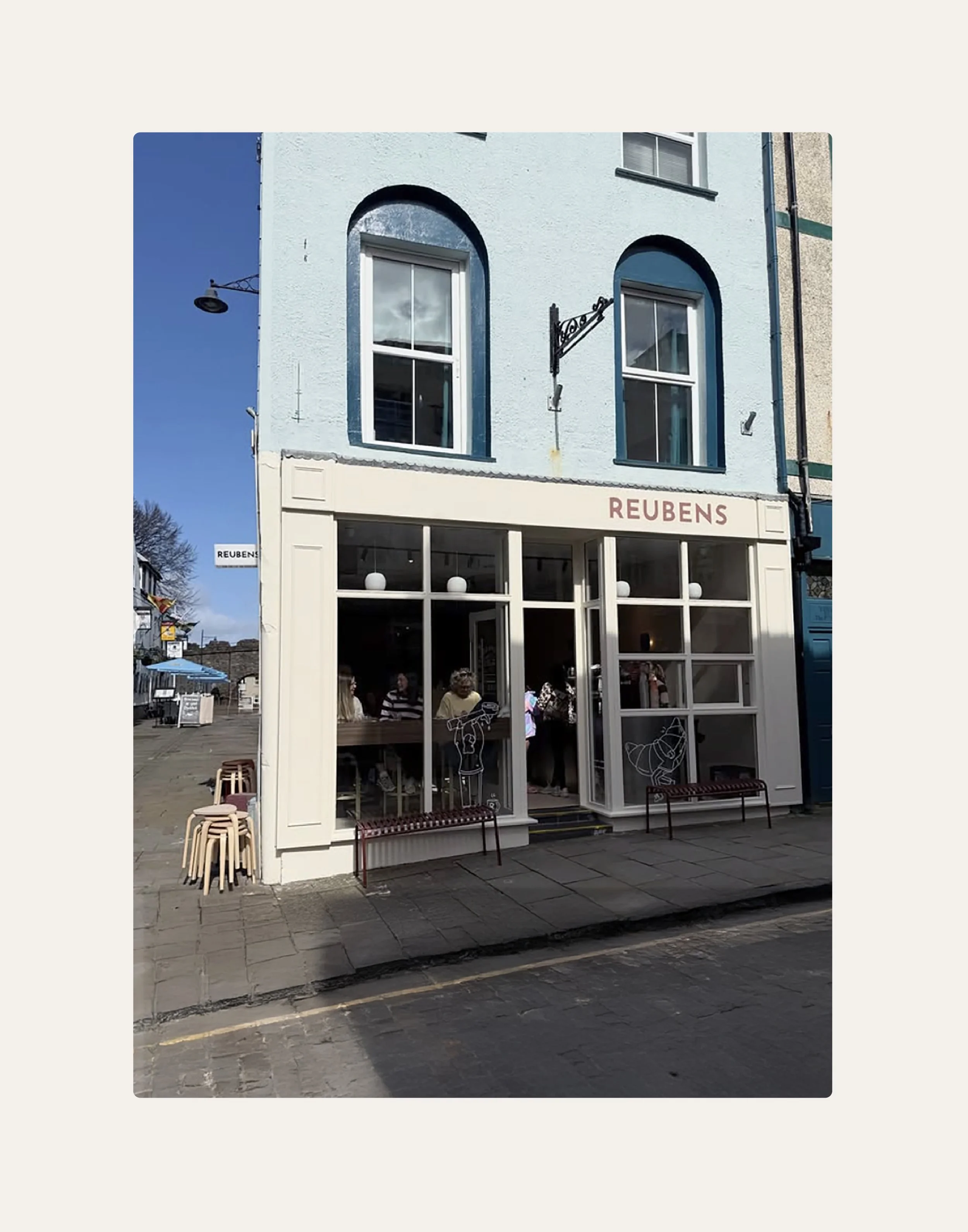
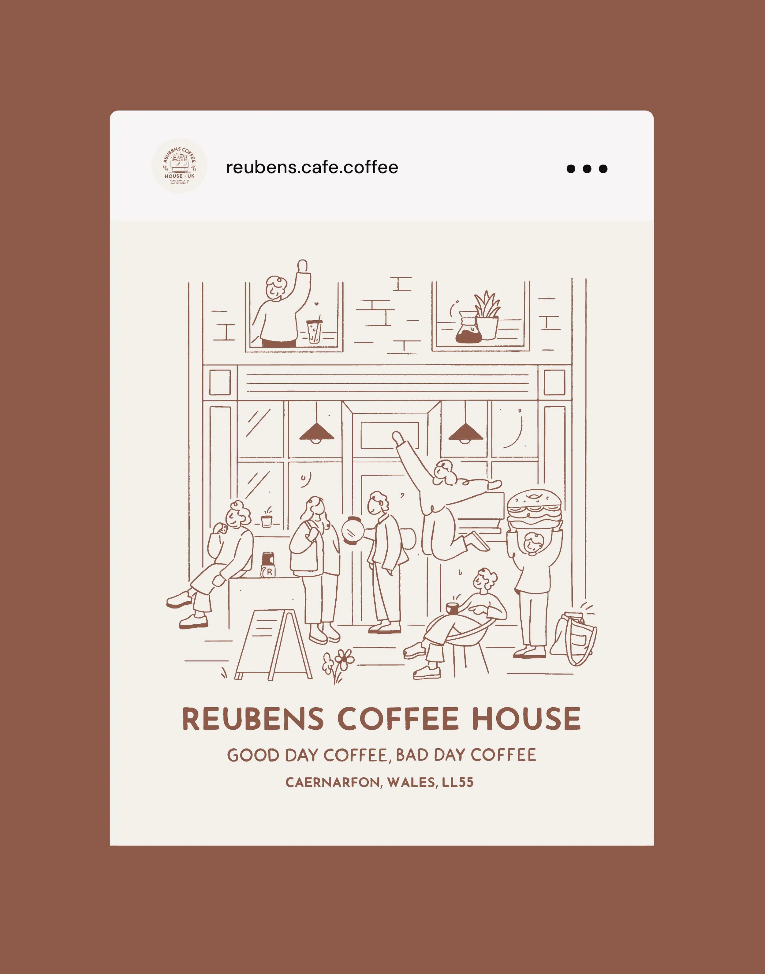
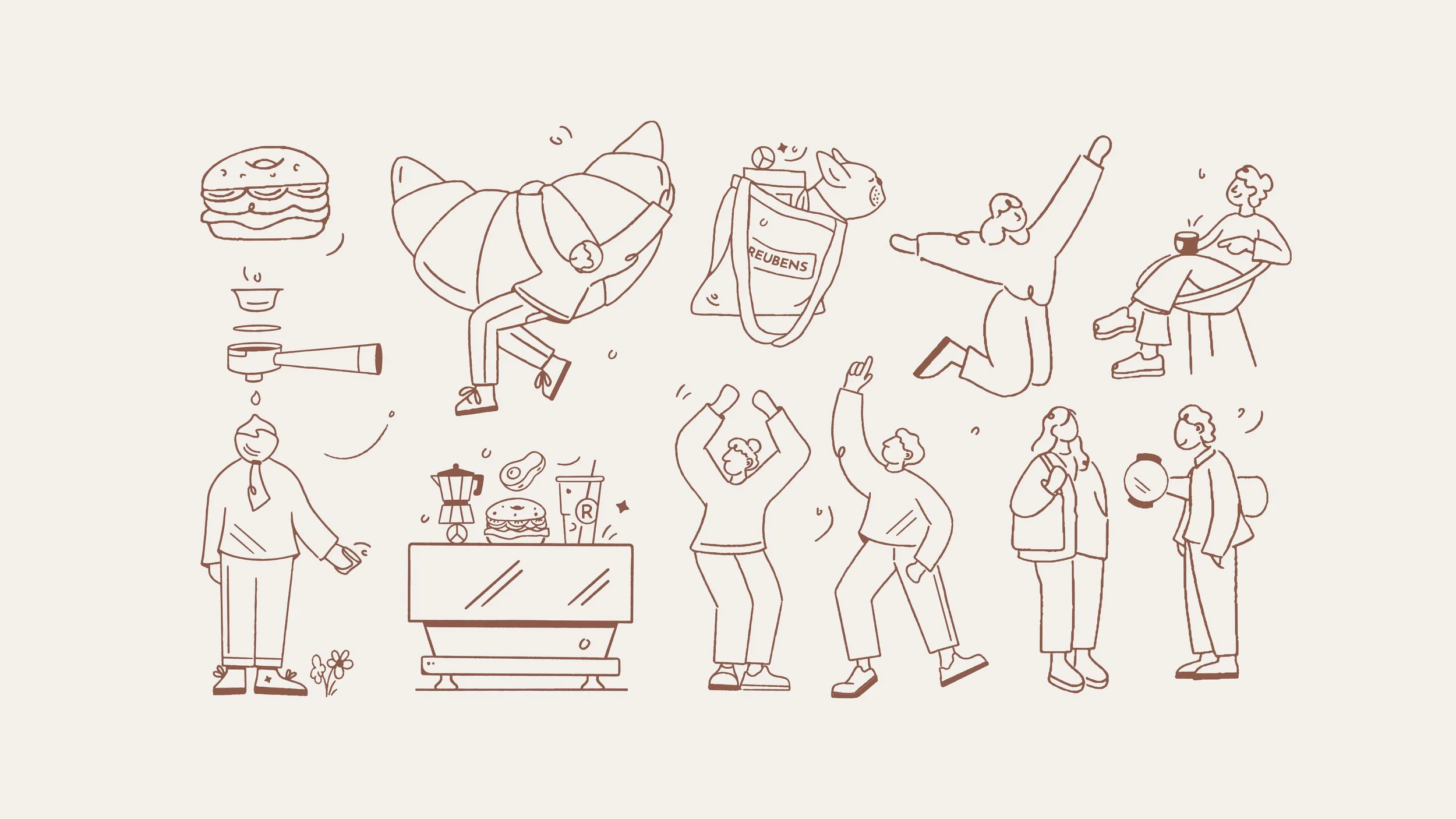
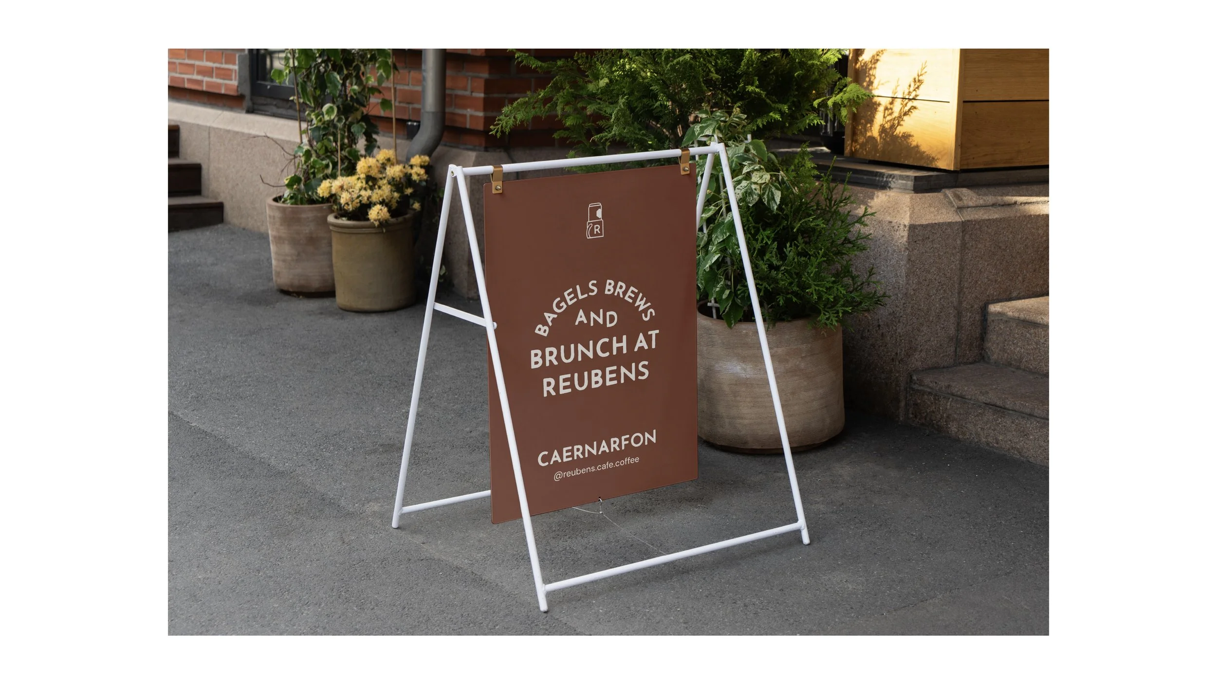
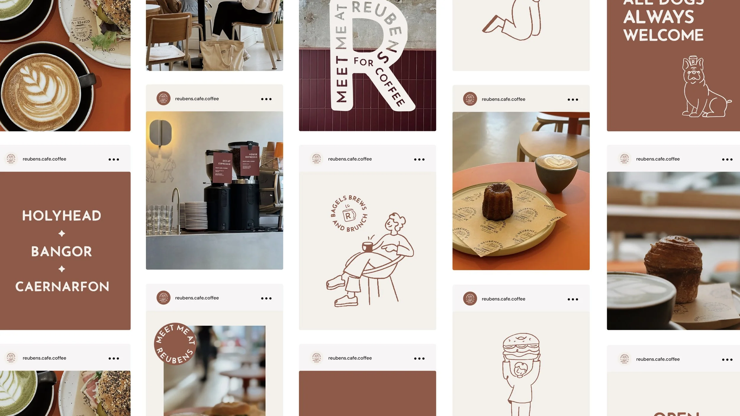
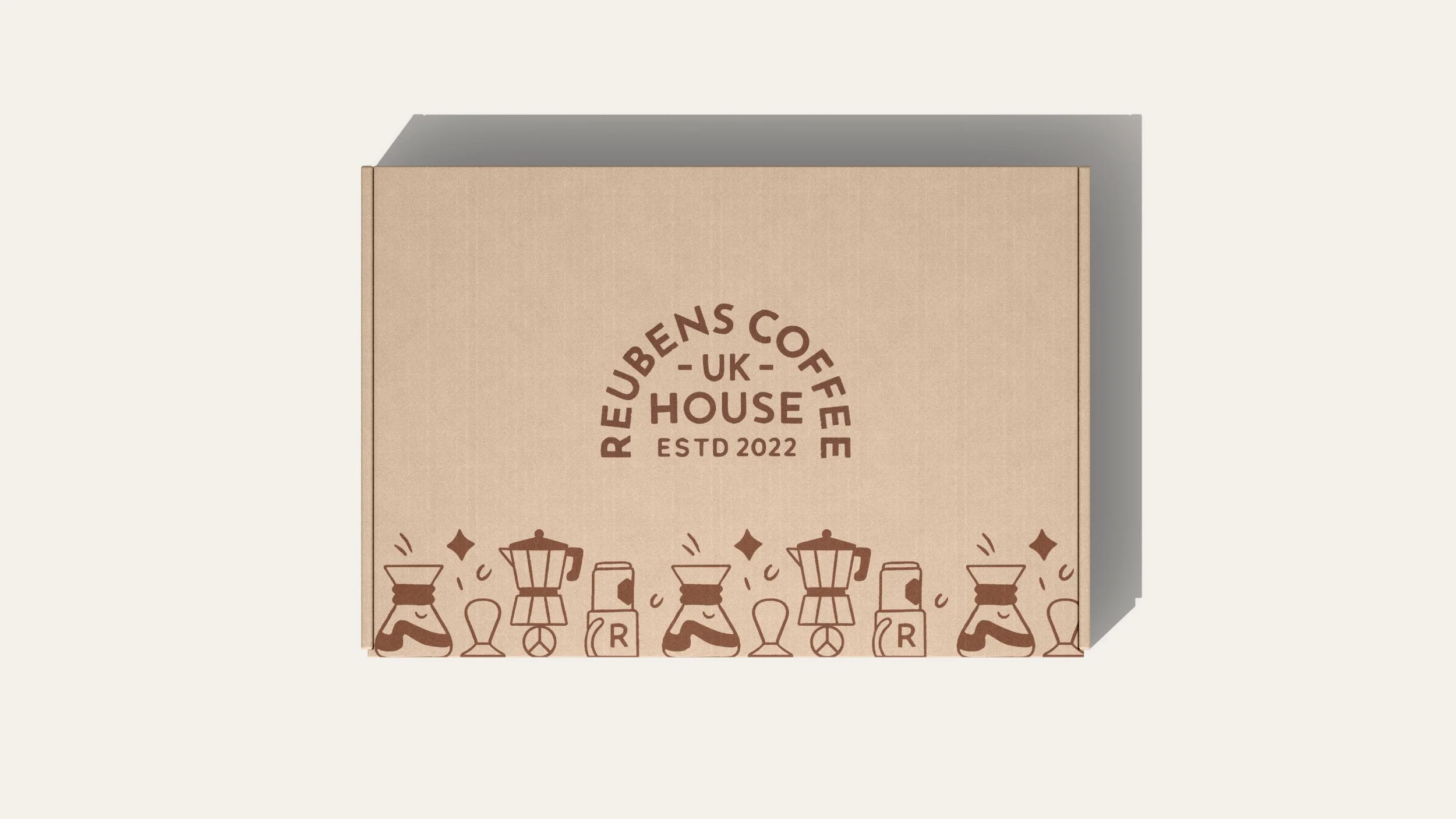
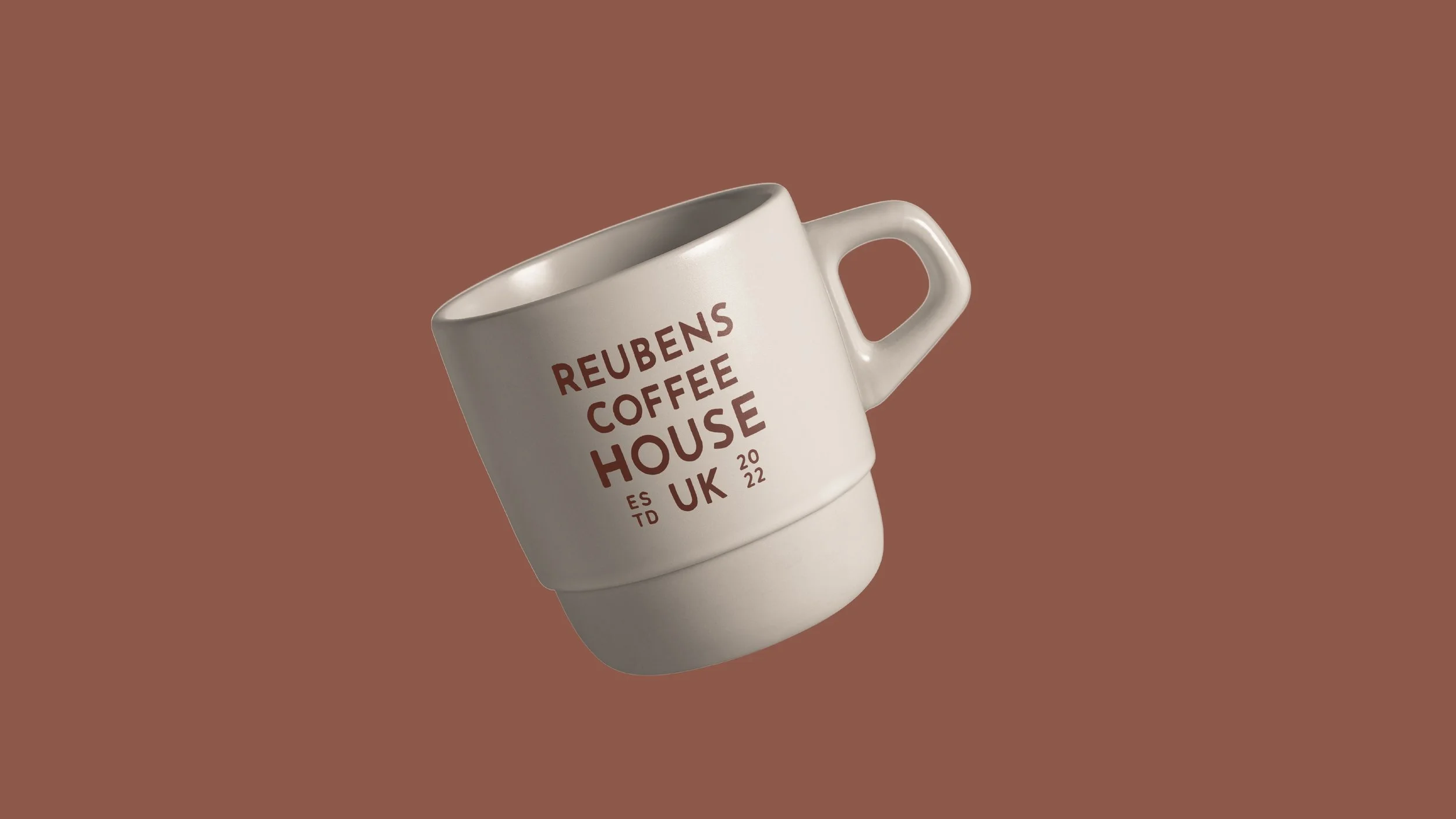
Brand identity for a neighbourhood coffee spot with big ambitions.

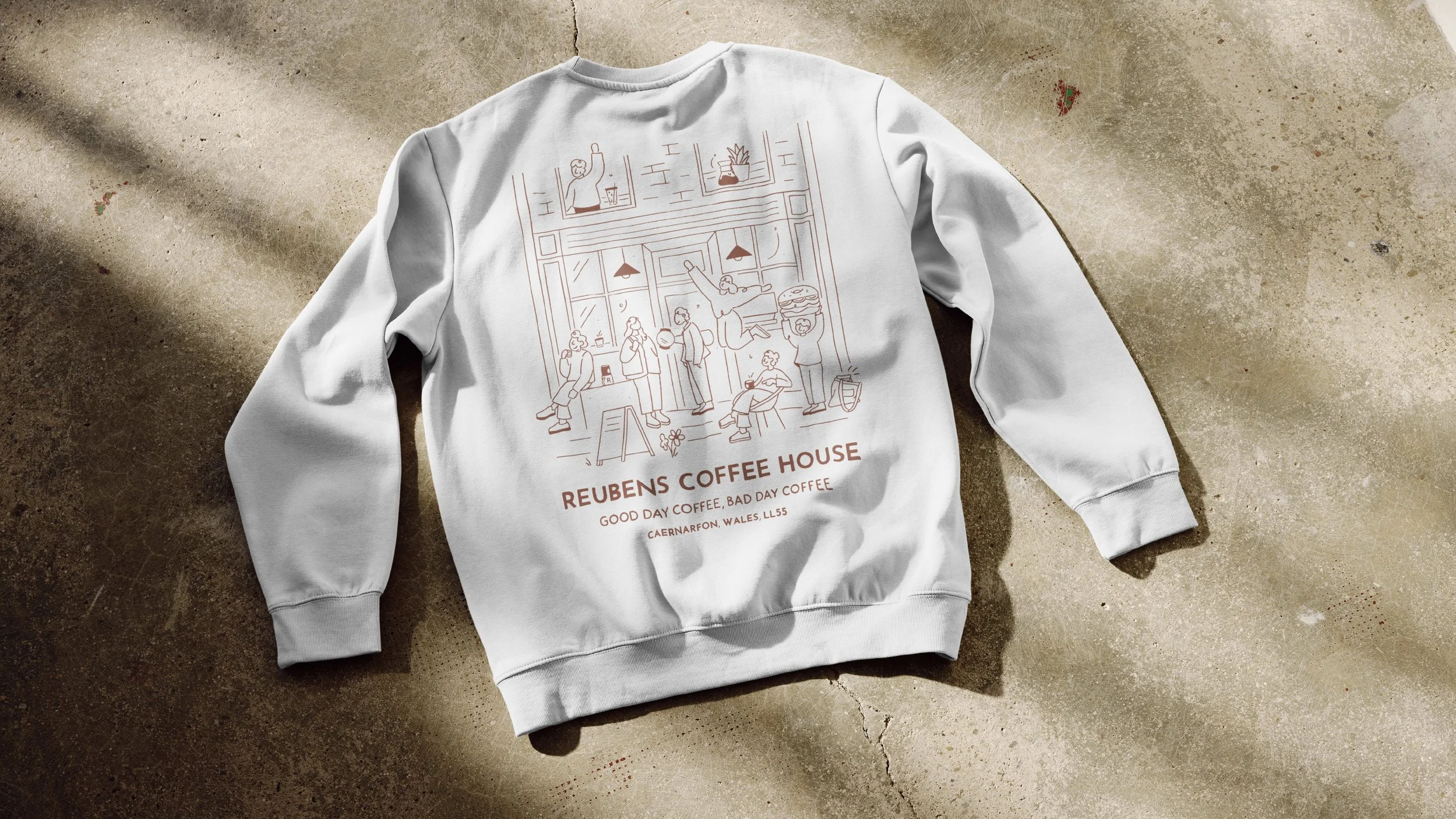
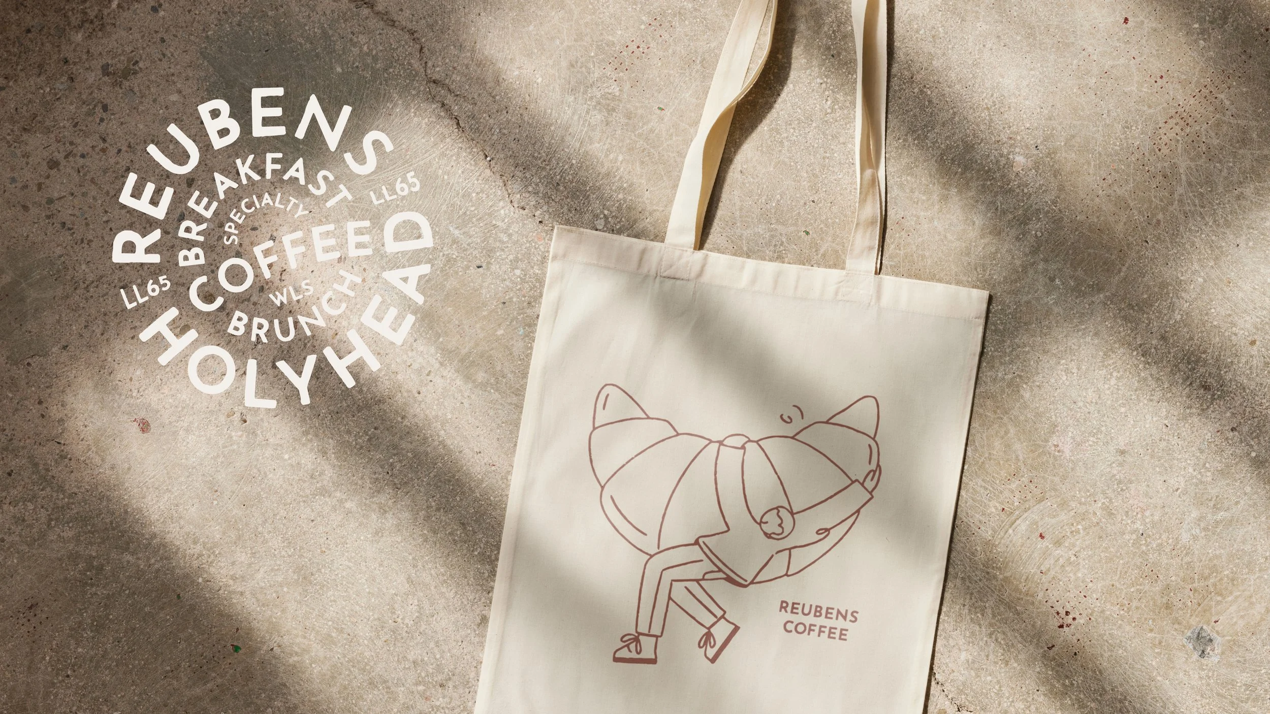
Reuben’s Coffee House came to us with a problem, their brand identity didn’t reflect the amazing experience they were building in-store. They wanted something impossible to walk past, with personality, warmth, character and longevity.

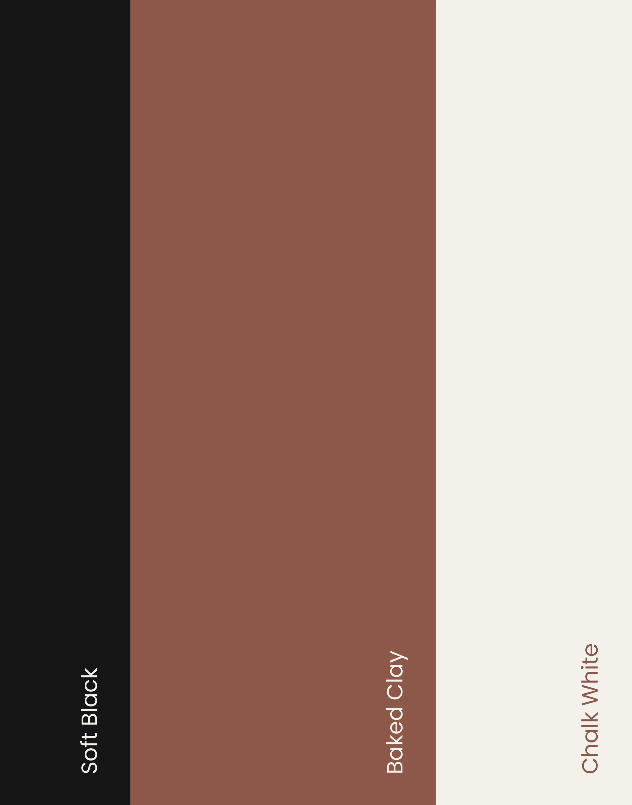
They had a lot of ambition and wanted to open multiple locations but first the branding needed a make over. It lacked clarity, consistency, and the kind of visual identity that would stick in people’s minds, which is especially important for a business built on repeat customers and word of mouth.


We leant into a very expressive, human feel through illustration, bold colour, and playful details to create something instantly recognisable. At the same time, everything had to be practical: clear menus, legible signage, and assets that work just as well on a takeaway cup as they do on Instagram.

Rather than overcomplicating things, we kept the idea simple: make the brand feel like the kind of place you’d want to come back to.


The result is a brand that feels warm, confident, and full of character.

It gives Reuben’s a clear visual voice something that helps them stand out locally while building a stronger connection with their customers. From in-store touchpoints to digital presence, the identity works hard across every part of the business.

Most importantly, it reflects who they are: a genuinely good coffee spot that people want to return to.