Ooomami - Brand Identity
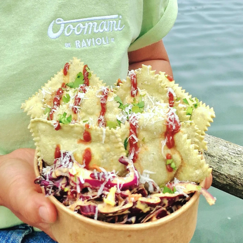
The business is owned by two best friends, one who is an amazing chef and one who is amazing at everything else. Together they came up with the idea to bring a different kind of street food to festivals, events etc.
Ooomami serve all organic, fried ravioli with high quality and natural ingredients. The flavours are seasonally inspired and they even do deserts!
They needed a visual identify which would grab attention at a festival, embody the love they have for the food and feel very fun and approachable.
-
Approchable, fun, delicious, colourful
-
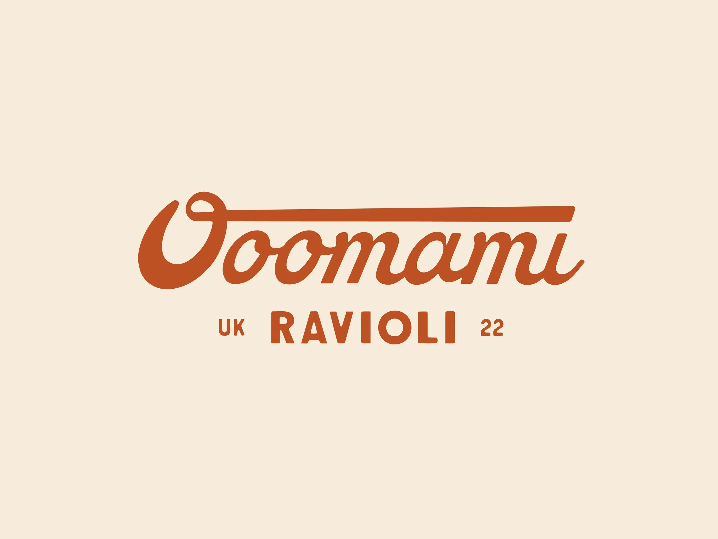
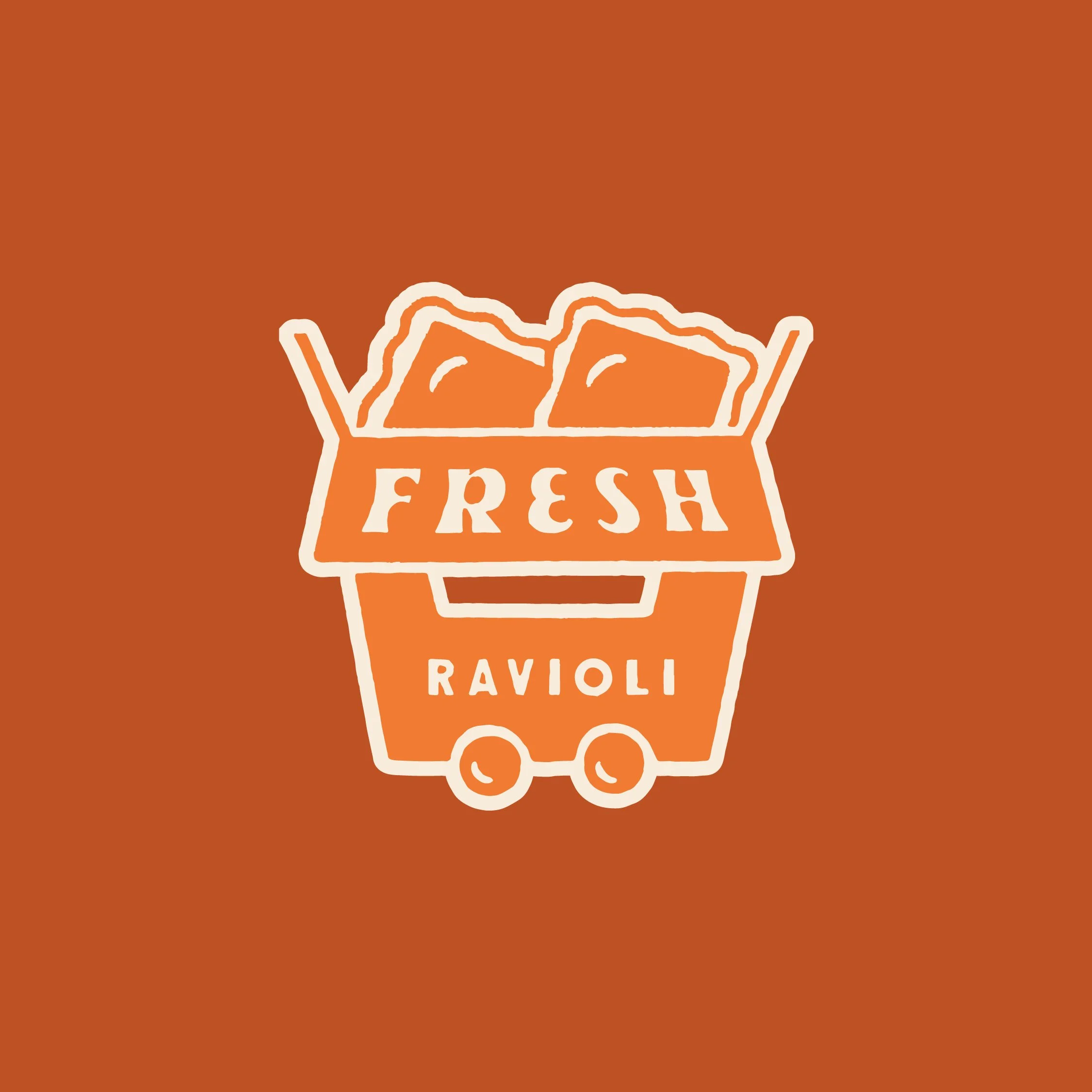
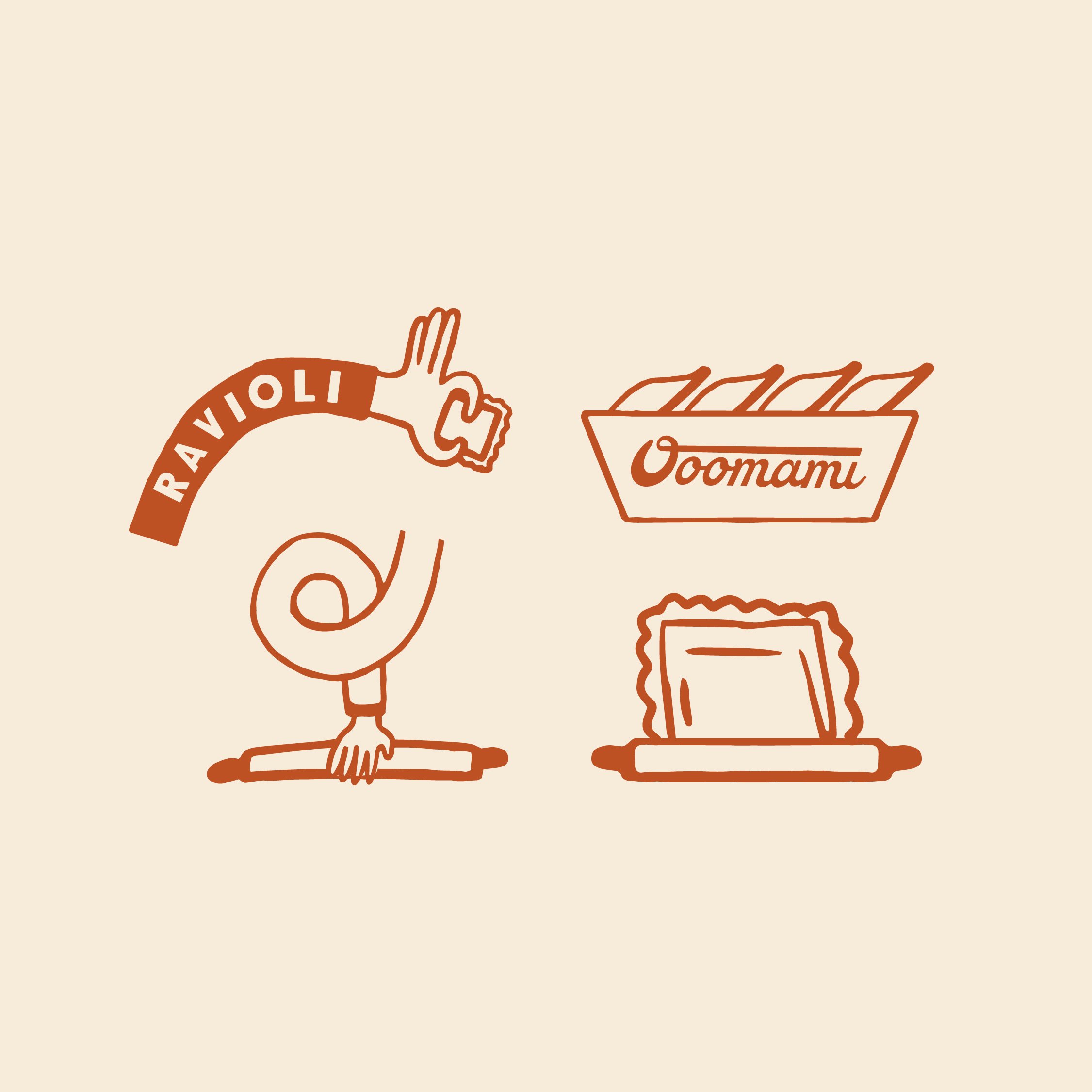
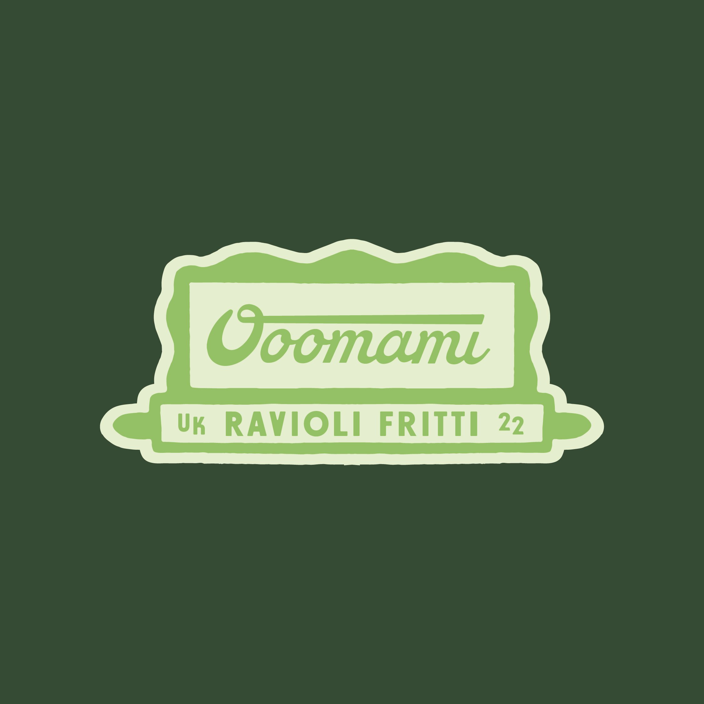
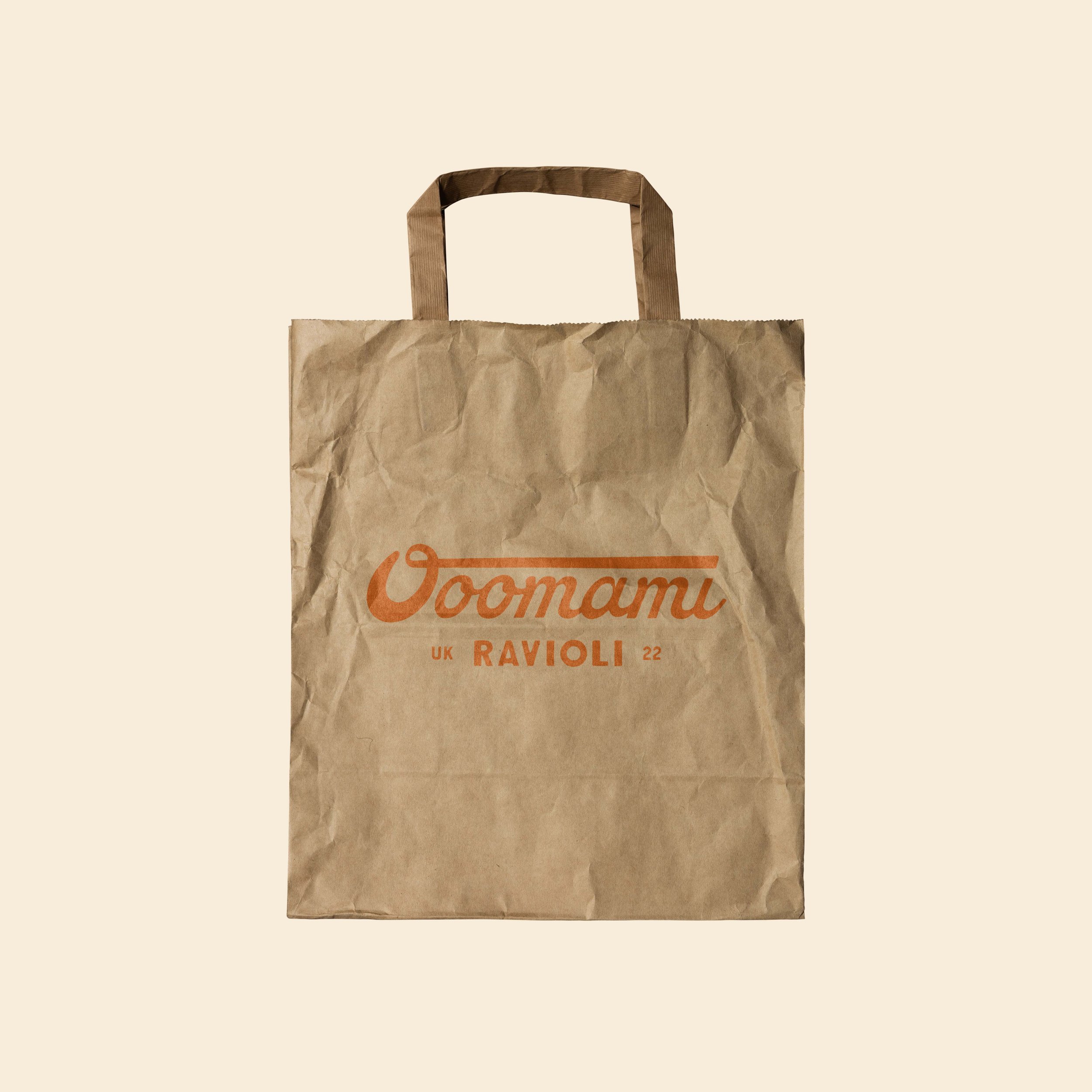
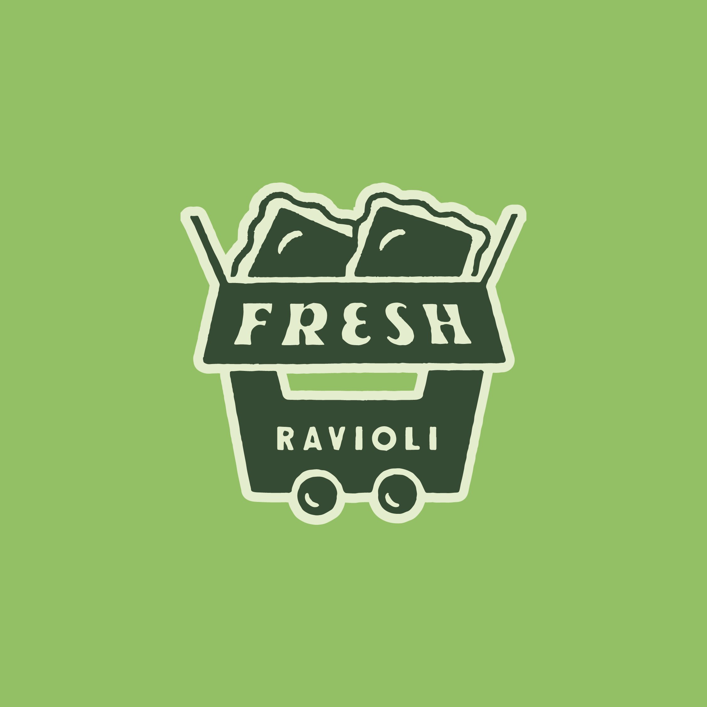
Logo system which included a Wordmark/Primary Logo, secondary logo, brand icon and brand illustration.
-
Food and Beverage