Brand Identity - The Milk Cart
I was jazzed to work on this project because The Milk Cart was getting set to open a shop pretty local to where I am based.
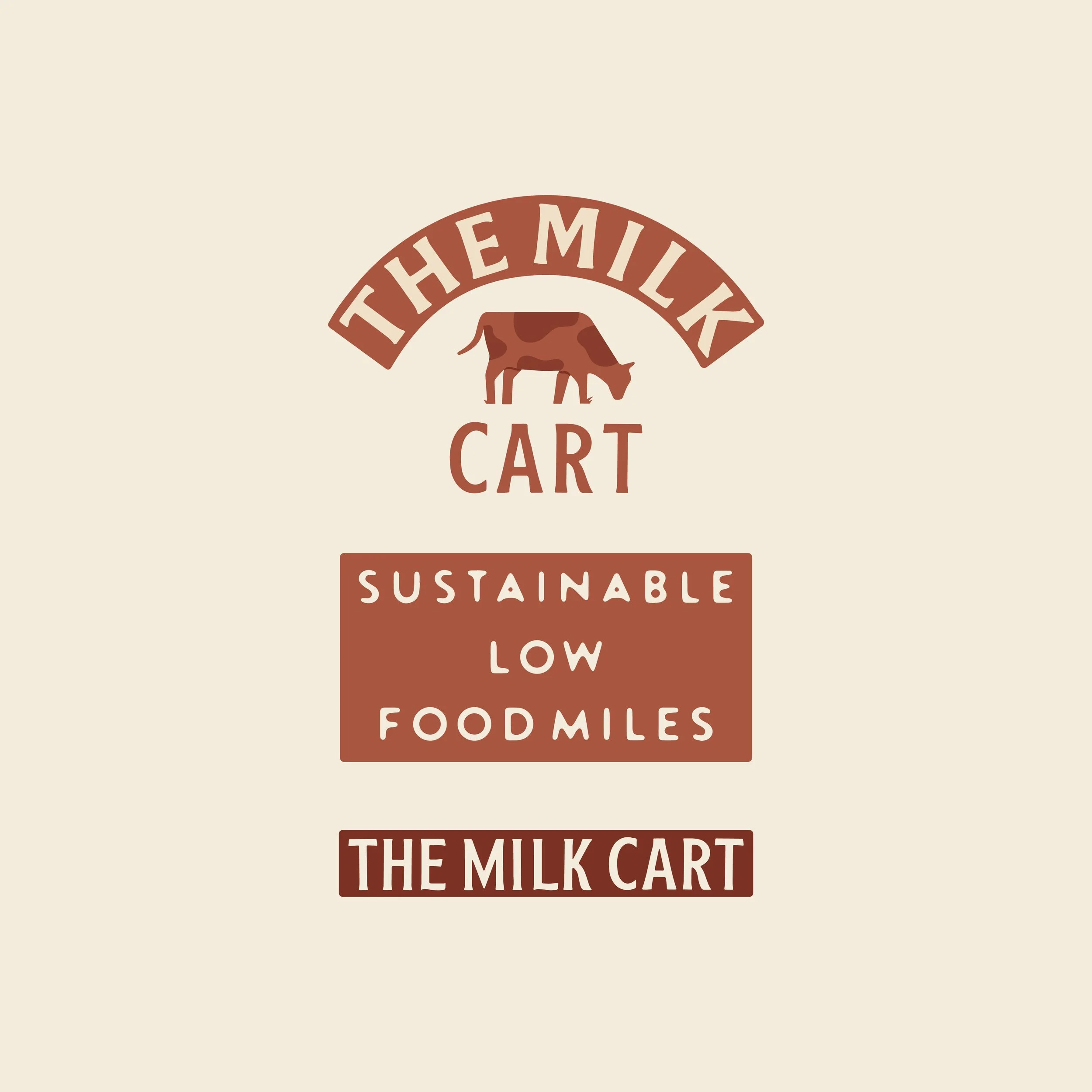
Logo system for lush local farm shop. This business values the environment, providing the freshest food possible and being part of a community. I set out to communicate these values through the style, tone of voice, colours and custom typography used throughout the brand assets.


Logo System Concept
The pencil represents the makers and community spirit of the brand while the river refers to the location and is a nod to the outdoorsy and adventurous customers the market will attract. The river Wye is the fourth-longest river in the UK and represents connection between places and in this case people. These two core elements have been visualised and combined in different ways to create the assets above. Scroll down for a closer look and how they can be used.