Logo Design - James Inge Photography
This logo system was created as part of a wider project and didn’t end up being used however the work feels relevant within the design industry at the moment so I wanted to share it here.
James is passionate about working with local businesses, especially in the food and beverage sector so it was important that his logo system communicated these pieces of information to attract his dream clients.
We wanted to go with a clean and contemporary style for his branding that still felt super approachable. It was also important that the visual identity is easy to use and dynamic.
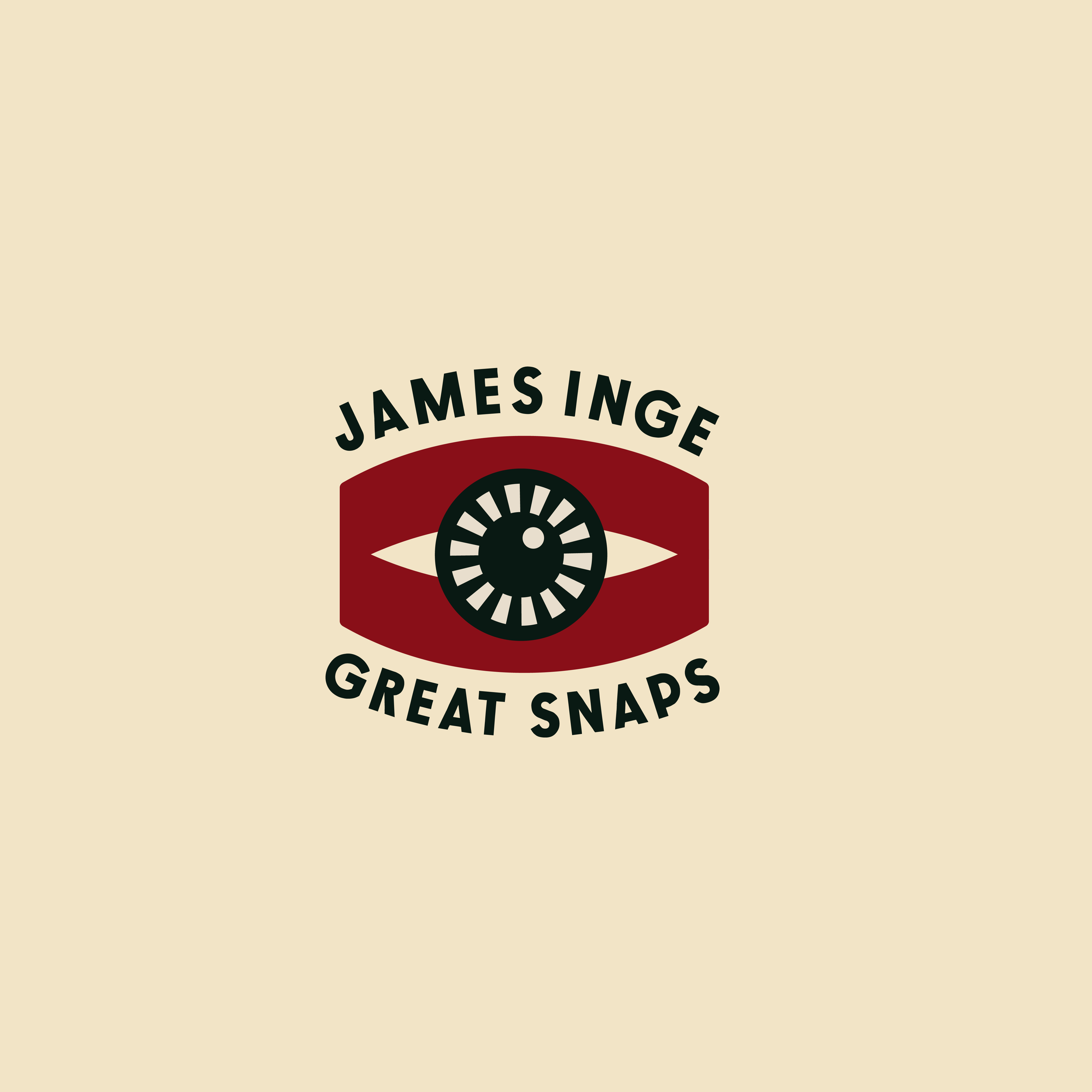

The inspiration behind the imagery came from the idea that a photographers camera is an extension of their eye and creative mind. I wanted to visually explore this idea so it could be condensed down into a minimal icon to be used throughout the brand identity.
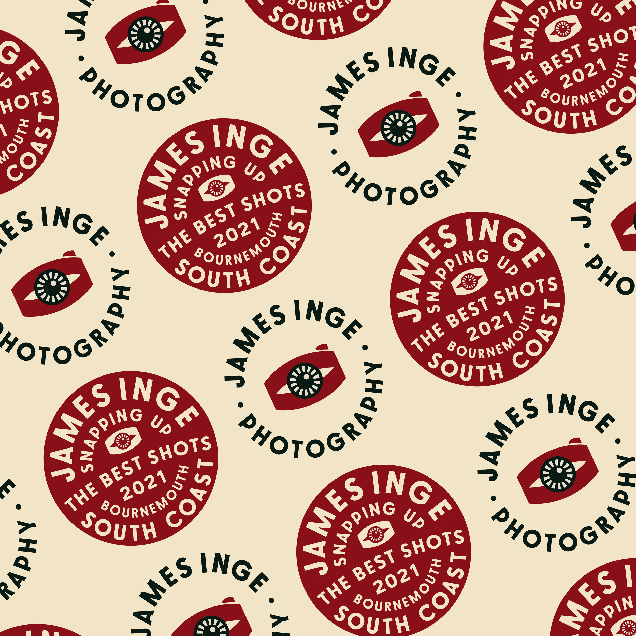

The system is set up in a way that means different versions of the logo can appear in different places. For example i.e social media, website, stickers, postcards etc. Due to the fact the colours and imagery style remain consistent the brand elements are always easy to recognise. This creates a flexible and fun visual identity rather than simply using one logo everywhere.