
Flo & Seb are on a mission to help others look after their physical and mental wellbeing through weekly planners which track mood, fitness, food and sleep. Users are also able to plan their shopping/meals, practise relaxation techniques and do a little colouring along the way.
We worked together on establishing a flexible logo system which is easy to use across social media, their website and on the planners themselves. We also worked to create a core and extended colour palette for the brand and a set of typefaces which can be used online and in print.
Once this style was established the planner design could be started, it needed to be fun to use, informative and easy to navigate with a minimal but slightly feminine style. We ended up with 10 unique cover designs (we started thinking there would only be 3!)


As part of the design package, it made sense to create a set of 18x social media images which could be used throughout their feed alongside product shots. These graphics all included positive and inspiring messages to people which reflect the advice held within and purpose of the journals themselves.
Planner Designs


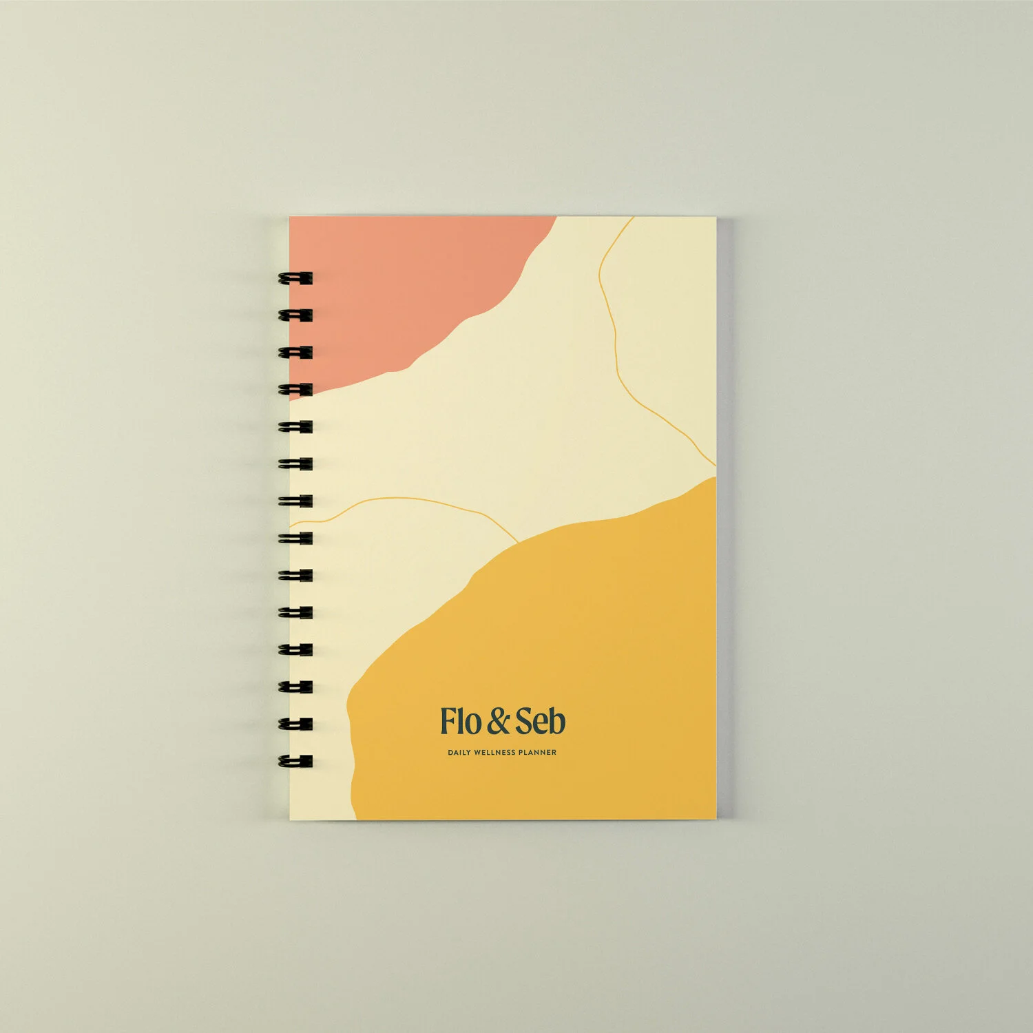

The covers needed to grab the attention of Flo & Seb’s ideal customer: Female, between 18-45, interested in mental/physical wellbeing and just generally looking to get organised. They are designed to reflect the relaxed and approachable content of the planner which focuses on improving peoples lives and never applying to much pressure to your goals.
Logo System


It was important the style of the logo system set up a starting point for the wider brand identity, by combining complementary fonts, pastel colours and feminine style it became easy to imagine how the visuals could translate to Instagram, their website and possibly printed materials in the future.
